The Philosophy of Logo Design

Why are these among the best, most recognizable logos in the world? Put simply: They can be burned on to the butt of a cow.
While "branding" has come to mean a large-scale marketing philosophy, let's not forget where the word "brand" comes from. One of the things that makes these logos so powerful is that they are simple without being simplistic; even tiny and without color, they are easy to identify.

In the larger sense, branding is an attempt to garner an emotional response to one's products and/or services. This may include specific color schemes, design styles, advertising focus, research and development, even hiring practices. The success of a company is determined by how well they empathize and interact with their market, which is an extremely complex and long-term process. I just want to get that out of the way because this is not an article about branding in the larger sense. This is an article about the logo.
It would be hard to argue that a company's success is determined by how well their logo is designed, that simply isn't the case. It is the case, however, that quite nearly every successful company has a well designed and often iconic logo.*
Humble Beginnings
 Logo-centric branding is actually an extremely new phenomenon. Some of our most beloved logos were introduced years after the companies were founded. The Rolex Watch Co. was in business for more than a decade before they registered the now-famous crown. Almost 30 years after he started making shoes, Adi Dassler added 3 stripes to the design, but it took another 22 years for adidas to give us the Trefoil. Levi's distinctive red tab made its first appearance 63 years after Levi Strauss and David Jacobs patented their unique design for making pants.
These days, of course, the process works in reverse. A logo is typically the first concrete evidence that a company even exists. Most entrepreneurs have a plan for their business cards before they have a plan for their business. Something about having a logo makes a business plan feel official (even if, as it happens so often, it is doomed to fail). The logo has become such a ubiquitous necessity that entire companies devote themselves almost exclusively to turning out thousands of logos every month.
So, since we can no longer take the time to learn our market before conceptualizing a logo and since the world is already flooded with symbolic imagery, how does one decide on a logo that actually stands out in the market?
I have no idea. Remember, your branding philosophy will determine how successful you are, not your logo. However, there are some extremely important principles to remember when you decide on the face of your company.
The Great Misconception
The generally believed first-rule of logo design is that your logo should represent your company. If you are a plumber, you should try to incorporate pipes or water. If you make yachts, use the outline of a boat. A DJ should use a record. Are you in the sports industry? Make your logo look fast.
This idea is almost totally wrong. What does a bunny have to do with naked women? What can I learn about a car company when I see a stylized bowtie? What does a peacock say about a television station? Nothing. Nothing. And nothing. Your marketing strategy, not your logo, will define your business. If you are doing it right, your market will make the association no matter what your logo looks like.† It simply has to feel right.
 This is one of the most hard-to-accept design doctrines, probably because it seems so counter-intuitive. The point is to create an iconic image that people will associate to your larger message. Going back to my original example, what does a rotated "15" have to do with herding cattle? Nothing. But when would-be cattle rustlers see that symbol, they understand, "This cow belongs to the Lazy 15 Ranch and if you steal it you will be shot by John Thomas." That is branding at it's finest.
 Some companies, in fact, have completely changed their corporate image by deliberately using a design that defies conventional wisdom. Of the myriad companies who have tried re-branding campaigns in recent years, perhaps none have been as successful as BP. In 2000, BP radically changed its logo from the decades-old green shield to a completely new sunburst design (affectionately referred to as the "helios" mark). Aside from being unrepresentative of a company who's focus had been petroleum for nearly 100 years, the flowery design looks more like something one would expect from an organization like Greenpeace.‡ The new logo was introduced as BP changed its marketing focus toward its more environmentally friendly energy policies. BP understood this simple principle: your logo should represent your message, not send it.
Wordmark
Perhaps there is no better way to illustrate this principle than through the wordmark. Since it is nothing more than the company's name, having the wordmark send any kind of specific message is difficult. In time, this will only strengthen its associative power. Your marketing message (not the logo's look) will be exclusively responsible people's emotional reaction to your company.
Here is a frequently used illustration of the wordmark's effectiveness. These are six world famous companies:
Disney - Miller - Panasonic
Coca-Cola - Ford - Spalding
On their own, there is nothing to distinguish one from the other. However, displayed like this:
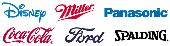
...each company comes to life. I'm willing to bet you didn't even read the names of all six companies until you saw their logos. Never underestimate the power of the wordmark. I admit, burning a cow with an intricately created "Coca-Cola" brand would be downright cruel, but that sad image doesn't diminish from the strength of that particular logo. When designed correctly (i.e. not simply typing the company name in an existing font, but creating a unique font in an appropriate style), the wordmark can be an impressive image.
Get a Designer
Which brings us to our last principle: Get a designer. The most oft-neglected step, especially for small, start-up, or local companies. Whether because of money constraints, time limitations, or simply an aversion to the creative indistry, too many companies shortchange their own image. Many decide to design their own logo, some will farm out the design to one of the aforementioned logo companies, and others will rely on someone under- (and in some cases un-) qualified to design a logo at all. Like any other part of a business, graphic design is best left to a specialist.
Take your time when deciding on a logo. Insist on several drafts with various examples. Have fun with it and allow your designer some creative leniency. You're going to be burning this image on a lot of cow butts, it may as well be professionally created.
Breaking the "Rules"
Finally, it would be naive to think that every great logo is able to be turned into a hot-iron brand. In fact, some of the best logos are far too intricate. These logos are based on a more traditional "Coat of Arms" design. Generally, coat-of-arms logos denote more class than symbol logos. They are much more elaborate and sometimes more colorful than their symbolic counterparts, but can generate the same types of emotional response.
Whatever final product you end up with, remember to treat your logo with near-parental care. Ideas drive marketing campaigns. Don't expect your logo to sell itself and certainly don't expect your logo to generate business all by itself. Build it a home, give it some room to grow, and surround it with positive influences. Slowly (very slowly) your logo may just begin to stand on its own. If you're lucky, your logo will come to symbolize not just your specific company, but your actual business philosophy.
Take one more look at those original logos and think about their humble beginnings. Apple, Volkswagen, McDonalds, Nike, Shell. Without thier long-term branding campaigns, those images mean nothing. What does an apple have to do with computers? How could a stylized "M" possibly make me hungry? And what is that silly orange shape, anyway? Now, however, they stand tall and proud. Those silly, unrelated shapes perfectly embody a grand message without saying a single word.
I'm going to get a burger.
...
*Not every major company has a good logo. Notable exceptions might include Berkshire Hathaway or Group 1 Automotive, both Fortune 500 companies – though it should be noted that neither company actually use their own logo to advertise their business or perform their services. MySpace is another wildly successful company with a remedial logo, though I suspect a design team at News Corp. is hard at work redesigning, modernizing, and web2.0-izing the original.
†Though almost all major companies have avoided product-specific imagery within their logos, there are also notable exceptions to this rule including Burger King, the NBA, and New Line Cinema.
‡It's interesting to note that BP and Greenpeace have recently set aside some of their differences to actually work together on some issues. Regardless of where you stand politically or how you feel about either organization, this may be the greatest evidence that BP's re-branding has been a massive success.
One final note. If you are happy with your logo and need information on branding, I would direct you to The 22 Immutable Laws of Branding. This may not be the best book on branding ever written (maybe it is?), but it contains essential information that many small companies (and even a lot of large companies) completely neglect. I highly recommend it.
love it. great read. however, it's volkswagen, not volkswagon ... ;)
Posted by Anonymous |
5:02 AM
Anonymous |
5:02 AM
Excellent Read, I think it is something companies should know also - as most have preconcieved notions on what a logo "should" be even if it isn't true or not.
Posted by Ross Johnson |
6:12 AM
Ross Johnson |
6:12 AM
This is an amazing blog. I very much look forward to your next post.
Posted by Anonymous |
10:08 PM
Anonymous |
10:08 PM
an excellent blog post. Loved reading it, and am still waiting (patiently!) for your next one.
Posted by Chris Betcher |
7:48 PM
Chris Betcher |
7:48 PM
Excellent Post! I have passed through another website having some really good articles. You may find it useful in understanding Logo designing. Here's the url...
http://www.logoblog.org/wordpress/design-archives/
Posted by Nichole Great |
3:10 AM
Nichole Great |
3:10 AM
You should update the blog...
All the stuff you've written is EXCELLENT and you should keep that work (you'd have at least one reader from Spain :-)).
Kind regards and write again please!!!! :-)
Paquito.
http://paquito4ever.blogspot.com
Posted by Paquito |
7:27 AM
Paquito |
7:27 AM
I love your blog
Posted by Eddy_半瓶水響叮噹 |
3:40 PM
Eddy_半瓶水響叮噹 |
3:40 PM
this is really good advice i need it to make the logo for my blog thanks.
Posted by Unknown |
1:54 PM
Unknown |
1:54 PM
I am not sure the detroit pistons brand should be among the greats. I offer more opinions in Movie Reviews.
Posted by Unknown |
10:39 PM
Unknown |
10:39 PM
Great information. Definitely puts a new spin on the relationship of a logo to a company's brand.
Posted by Aubrey Jones |
10:37 AM
Aubrey Jones |
10:37 AM
Interesting post. Thanks for writing this
Posted by MMK080 |
6:24 PM
MMK080 |
6:24 PM
Great post.
Another interesting topic would be the mutability of branding through logos or iconic marketing images. Take the Nike swoosh for example: the swooshstika; take iPod's iconic silhouette: transformed to icons of Abu Ghraib torture to protest the war in i-Raq.
Just a thought.
Posted by Anonymous |
11:13 AM
Anonymous |
11:13 AM
Great Post. Chalked full of informative information. Branding is all about recognizing product or services. You can brand anything, and with the right training on marketing, you've now got a business. Learn how to market and branding becomes more relevant.
Thanks,
http://internetmarketingtrainingforfree.com
Posted by Internet Marketer |
10:01 PM
Internet Marketer |
10:01 PM